
From the calm you seek during a morning pause to the sense of release you crave at day’s end, colour influences these moments more deeply than we realise. Grounded in colours according to moods, the impact of colour on psychology shapes how relaxed, refreshed, or energised you feel within your bathroom. Choosing the right bathroom colours is therefore not just a design decision, but a conscious step towards creating a space that nurtures calm, encourages positivity, and elevates everyday rituals into moments of quiet wellbeing.
- Bathroom
- Kitchen
- Inspiration
- Care
- About Us
- Enquiries

The Psychology Behind Colour and Emotional Wellbeing
Colour psychology explores how different shades affect our thoughts, emotions, and behaviour. In intimate spaces like bathrooms, these effects are felt even more deeply.
Colours interact with our senses almost instantly. Soft tones can slow the heart rate and reduce stress, while brighter hues can energise and stimulate. When applied mindfully, bathroom colour schemes can create a balanced emotional environment that supports calm mornings, mindful self-care, and restorative evenings.
Why Bathroom Colours Matter More Than You Think
Bathrooms are personal spaces where moments of solitude, reflection, and relaxation unfold. The colours surrounding you can either enhance or disrupt these experiences.
The right bathroom colours help create a sense of cleanliness, openness, and emotional ease. Since bathrooms are often enclosed spaces, colour choices influence how spacious, airy, or intimate they feel. Selecting hues that align with relaxation and positivity ensures the space feels inviting rather than overwhelming.
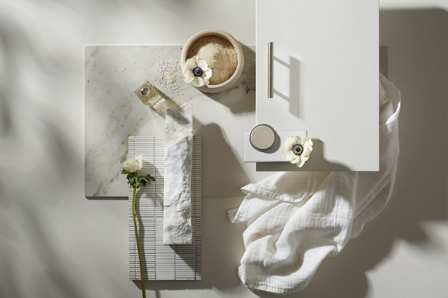
Soft Neutrals: The Foundation of Calm and Comfort
Neutral tones are versatile and deeply soothing, making them a favourite for premium bathroom design. Shades like warm whites, soft beige, greige, and muted taupe serve as excellent calming colors for bathroom spaces. These colours reduce visual noise, allowing the mind to unwind effortlessly. Neutrals also create a spa-like atmosphere, promoting clarity and mental stillness while offering the flexibility to layer textures, finishes, and fixtures without visual clutter.
Blues and Greens: Nature’s Most Relaxing Palette
Inspired by water, sky, and foliage, blues and greens are among the most effective relaxing bathroom colours.
- Soft blues evoke serenity and freshness, helping lower stress levels and encourage calm breathing. They are closely associated with open skies and flowing water, signalling calm and openness to the mind. Psychologically, they help slow the heart rate, reduce tension, and promote relaxed breathing.
- Muted greens connect the space to nature, symbolising balance, renewal, and wellbeing. They draw from our natural connection to the outdoors and are among the most restful colours for the eyes. They promote psychological balance, renewal, and stability, helping the mind recover from daily stress. In bathroom spaces, muted greens create a grounding, reassuring atmosphere that feels gently restorative.
Together, these shades reinforce the psychological association with cleanliness and tranquillity. When incorporated into bathroom colour schemes, they create a restorative, emotionally grounding environment, making it ideal for unwinding after a long day.
Earthy Tones: Warmth, Stability, and Subtle Luxury
Earth-inspired colours bring a sense of comfort and reassurance to the bathroom. Terracotta, sand, clay, and warm stone hues foster emotional warmth and stability. Earth-inspired colours create a deep sense of comfort by tapping into our subconscious association with nature and shelter. These tones gently ground the senses, adding depth without heaviness. Their organic appeal supports positivity by creating a nurturing environment that feels both luxurious and reassuring, especially when paired with natural textures or refined finishes. In a bathroom setting, these tones soften the space and reduce visual stress.
Pastels and Soft Accents: Gentle Positivity Without Overstimulation
For those who prefer a hint of colour without intensity, pastels offer the perfect balance. Pastel shades bring emotional lightness to the bathroom without overwhelming the senses. Powder blue, blush pink, lavender, and pale mint introduce softness and charm while maintaining calm. These shades subtly lift the mood, making the space feel light, welcoming, and emotionally soothing. Pastels work beautifully as accent walls or within layered bathroom colour schemes, adding character without overwhelming the senses. Psychologically, these hues promote emotional comfort and openness, making the bathroom feel welcoming, soothing, and effortlessly refined.
Light, Space, and Colour: How They Work Together
Colour does not exist in isolation; it interacts with light, surfaces, and spatial design. Light amplifies the emotional effect of colour, shaping how the bathroom is perceived throughout the day. Natural and ambient lighting can enhance the psychological impact of colour, making shades feel warmer, cooler, brighter, or more subdued. Lighter bathroom colours reflect light and create an open, airy feel, reinforcing calm and cleanliness. Thoughtful lighting paired with harmonious colours ensures the bathroom feels balanced, uplifting, and visually restful throughout the day.
How to Create a Balanced Bathroom Colour Scheme
A well-designed bathroom balances emotional comfort with visual elegance. Achieving this requires intentional layering rather than relying on a single shade. Balanced bathroom colour schemes support emotional flow, allowing the space to feel cohesive, calming, and effortlessly refined.
- Start with a calming base colour for walls or large surfaces: Choosing a soothing base colour helps set the emotional tone of the bathroom, creating a sense of visual continuity and calm. Soft neutrals or muted hues provide a restful backdrop, allowing the space to feel balanced and uncluttered.
- Introduce complementary tones through tiles, fittings, or accessories: Layering complementary colours through finishes and accents adds depth and character without overpowering the space. This approach enhances visual interest while maintaining harmony within the overall bathroom colour scheme.
- Keep contrasts soft to avoid visual tension: Gentle transitions between shades ensure the space feels cohesive and easy on the eyes. Soft contrasts support relaxation by preventing sharp visual breaks that can disrupt the calm, serene atmosphere of the bathroom.
Designing a Bathroom That Feels as Good as It Looks
Colour has the quiet power to shape how we feel. This holds especially true in personal spaces like the bathroom. By understanding colours and moods psychology and choosing hues that promote calm, relaxation, and positivity, you can create a bathroom that supports emotional wellbeing every day. Thoughtfully selected bathroom colours don’t just enhance aesthetics; they elevate daily rituals into moments of calm and clarity.
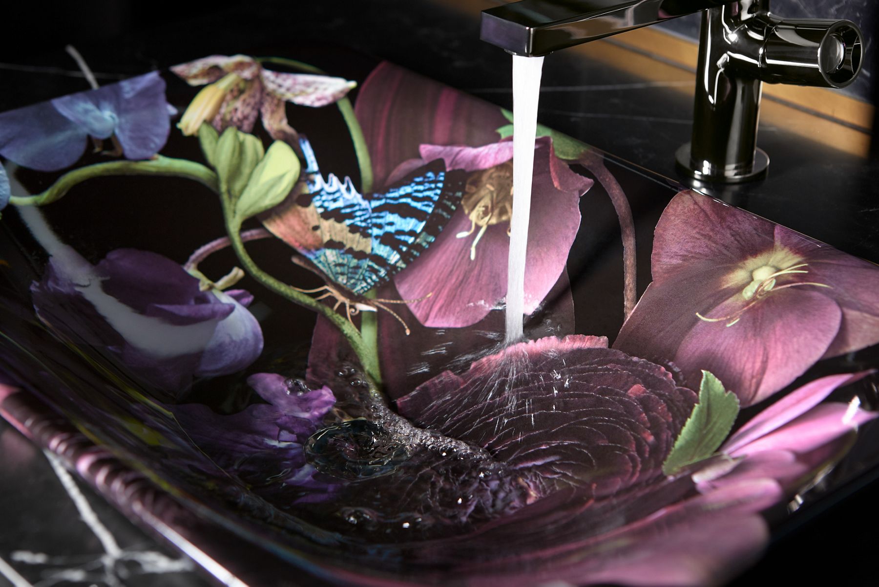
With a thoughtfully curated spectrum of colours across basins, toilet commodes, toilet seats, and bathroom essentials, Kohler enables design choices that reflect both personal expression and emotional comfort. When form, function, and colour come together seamlessly, the bathroom evolves into a sanctuary of balance, refined comfort, and quietly invigorating luxury.